During Google I / O at the beginning of the month, Google revealed several changes in Google Assistant, including much faster responses and a directional mode that promises to replace the current Android Auto interface. But by the way the company prepares one more change that had not been presented so far: a new interface.
Noted by members of the forum on Reddit, the new interface eliminates the white card that appears at the bottom of the screen, replaced by a darkening gradient toward the bottom, and the phrase Hi, Im listening. On the left is a button for At a Glance (Updates), which shows relevant information about your day, and on the right is a keyboard shortcut. In the last lines of the screen, a colored bar alludes to official Google colors.
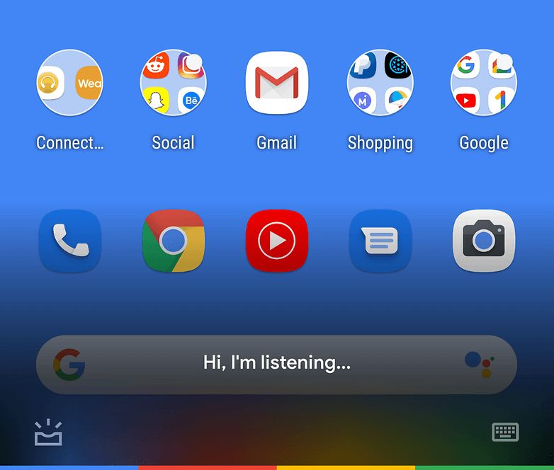
The new Google Assistant / SentientKayak interface, r / Google
The feature seems to be what is known in the industry as the A / B Test: two options are presented to users to determine which one is favorite. There is no set standard: According to the Android Authority website, users on a Pixel, Galaxy S10 or even Redmi Note 4 running a custom ROM have noticed the new interface.
Like the feature implemented in servers, there is no way to "force" the new interface to appear on your device. There is not yet a forecast of when, or even if, it will be adopted for all users.
And you, do you use Google Assistant? Share your experience in the comments
(tagsToTranslate) google assistant (t) google assistant (t) virtual assistant (t) siri (t) bixby (t) digital assistant (t) smart assistant (t) google i / o (t) android
