Since the new CEO of Evernote (Chris O’Neill, formerGoogler) assumed, it seems that we have seen more changes taking place than previously, in an attempt to improve the service and up in the app.
Because the company has just launched verse 8.0 of its iOS app, which came with several changes, including a totally new, more streamlined look.
If you stretch your memory a little, you will remember that the previous design was a little more full of features spread across the screen, at the top, at the bottom and especially the home screen. Now, instead of seeing a panel with everything in the app, the first thing you see is your most recent notes, so that “you can start working where you left off without needing additional clicks”, as you explain the company.
Something much more intuitive is browsing the notebooks; in this version, the name of the notebook in which you are located is at the top and, to change, just touch it to appear your list of notebooks. In addition, it is now possible to see all the notes you have set up with reminders just by tapping the clock icon at the top of any list and the same can be done with labels for this, you need to drag down to reveal the icons.
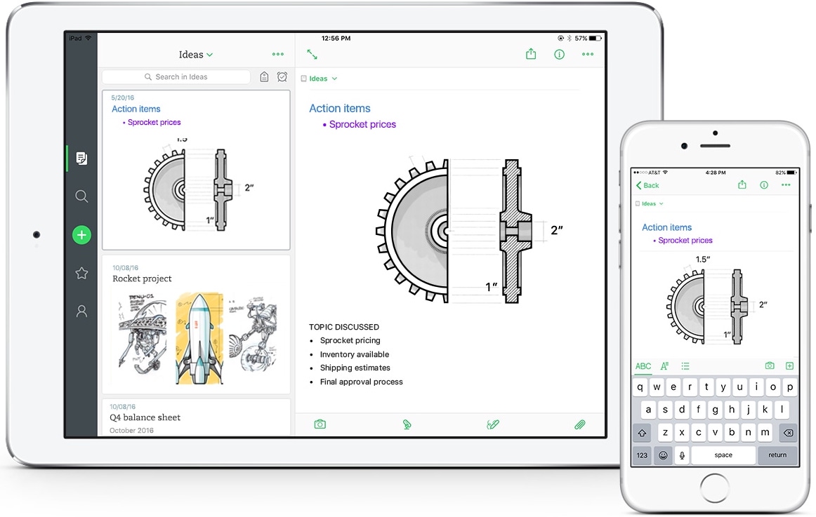
It is also much easier to add new notes from the home screen; just touch the + icon if you want a new note or touch and hold to reveal other options like audio recording, photo or reminder.
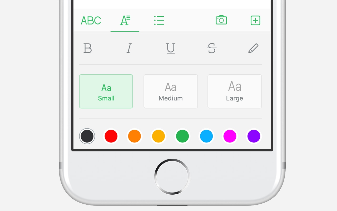
The options for styling the text and paragraph also improved a lot, leaving only the most relevant ones in the bottom bar (with font size, bold, colors, etc.), a camera and, at the end, a + icon to access the options that are used less frequently.
For plan users Evernote Business, improvements were also made. In “Account”, you can easily switch from your personal account to your business account (and vice versa).
O TechCrunch pointed out some “flaws” in the choices, for example, it is not known why the option of "Work Chat" now be hidden in the “Account” tab; in addition, when you drag down the list of notes and the sticker and reminders icon appears, next to it is another search bar, which doesn’t make sense because there is an entire tab just for that.
Either way, improvements are welcome. In addition to giving the app a new look, you can draw the attention of new or old users to continue or return to using it Evernote, moreover, has found it difficult to grow in its paid service. There are still improvements to be made, but for sure they have been paying close attention to this for some time now, which is great.
Now, the macOS version also needs a up corresponding. 😉


