note: two years ago, I said goodbye to the team to embark on the journey of working at Apple. I completed these two years with the company saying goodbye, and in search of new challenges. Accompanied by them, I return home that I missed so much. I am happy and excited to be back in a year that will be so busy, when Cupertino's darling completes ten springs!
In every launch, pre-launch or even in the very time of rumors, it has become common the perception that the all-new design from Apple has been lost. And not for less. We are not here to enter the merit that the magic or the power to innovate has been lost. Frankly, I think that in these matters the company's implicit promise still meets expectations, but I wouldn't say the same about the beauty of the products.
I will start with the example of iPad. The last major design change we had was in 2014, when the iPad Air was introduced. Which, by the way, was a larger version of the iPad mini, which was already an extended version of the fifth generation iPod touch. Before that, four years earlier, we will be born the design on the iPad 2.
Rounded corners, pale aluminum back, black or white glass front, with a button and camera. This design was perpetuated from 2011, still presented by Steve Jobs, until October 2013. Seeing it doesn't seem that much, right? No. As I said, his design was only adapted from a 2012 product, as the iPod touch already said. This drawing, it is worth remembering, is exactly the same today, almost five years later.
Therefore, we can say that there were three designs for iPads: the original, which died in just one year; the second generation, which lasted for almost three years; and the third, reused and used until today. Seven years for two undivided drawings and one adapted, sad.
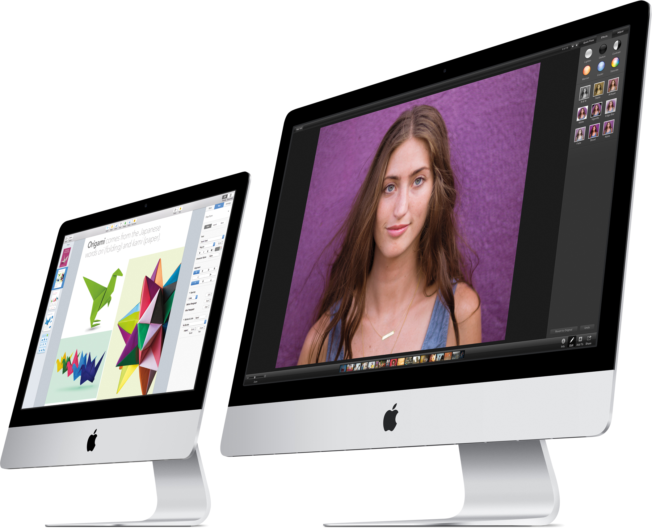
Changing families, we entered the Macs. Starting with table hair, being very generous, we can say that the iMac has * had * an aesthetic update in almost ten (!) Years. Of course, in 2012 it became a lot thinner, which is why I still count it as the only update since, in 2007, the iMac gained its aluminum and glass body.
In the case of other desktop Macs, the situation is as catholic as: the Mac mini has an aluminum structure unibody in 2009; in 2010 he lost the infamous CD / DVD drive; after that meh without going into the merit that it hasn't even gotten a processor update since October 2014, but that's beside the point. Speaking of forgotten Macs at the Olympic Park, the Mac Pro has been in Ma's drawer since 2013, when it won its first aesthetic overhaul in its 11 years of life.

Yes, the lixeirinha design, precursor of jet black, the Mac Pro's first aesthetic revamp since its launch in 2006. Three years ago, like its shelf counterpart, it has been standing in the Apple drawer.
Coming to MacBooks, the situation is somewhat less serious. Let's go to the Pro: who remembers, in October 2008, Jony Ive live and in color in a keynote, alongside Jobs and Tim Cook, presenting the first MacBook Pro unibody? I remember how revolutionary it was. A single, solid piece of aluminum. Seamless. What a day! After that, for nine years, we see only this masterpiece becoming thinner. But that is not all bad.
There are those who say they disagree with Apple's thinner as we canthis, as thin as we can get. I don’t, I like it. It may seem like a small cosmetic detail to most, but it is something that draws more attention, whether you realize it or not. as a favorable budget for your company: you like it, it gives you good results and you spend the minimum necessary. Imagine if you get the same degree of satisfaction, with the same results, spending even less? that is exactly the philosophy, only less sensitive. You know how good the product is when you realize that it is advancing, getting better, more powerful and effective, and still getting smaller (thickness and volume). The natural feeling we have is that something is more innovative than it really is.
Who has the iPad 2 and migrated to the first iPad with Retina display, which had its thickness increased due to the new display, certainly had a feeling of return. There is no such thing as I would prefer it to be thicker and have more battery or more processor; rationally we can even think about it, but the involuntary sensations are still stronger, even if we don't realize it.
With that we arrived at two post-design reviewsunibody: the first in 2012, with the so-called MacBook Pro with Retina display, which in addition to the exchange of I / O, the computer has become 20% thinner. In 2016, 16-18% thinner and switched from I / O to function keys to the Touch Bar, called MacBook Pro with Touch Bar and Touch ID. As a former owner of the model unibody 2012 and current owner of the 2016 model, I say that these post-unibody they are rarely perceptible to innocent eyes: my husband or mother, who care little, wouldn't even notice that I changed computers if I hadn't told them.
Although I think the new MacBook is the best notebook I have ever used, it still lacks that magic of the time that revolutionized design with the case unibody. I reinforce what I said a few times in the text: I am not criticizing nor could the news about the products, or the MacBook Pro itself: they are incredible. The Touch Bar surpassed my expectations my transition to the USB-C world has been smooth, but I repeat: the magic of my God is missing, how beautiful!
In the case of MacBooks Air and MacBooks, the story is similar. Launched in 2007, the Air had its revision in 2010 (seven years ago) and, after that, in a scale game, Apple launched the MacBook that took exactly the essence of the Air, in a 1.3 inch smaller scale, and with minimum I / Os (read USB-C and output for headphones).
In a general overview, we have the scoreboard for 2010 so far: with the exception of the Mac Pro, all the other five members of the line did not have a design update that would leave us doing that Wow. It is difficult not to regret.
Finally we come to him: the infamous, the most loved and hated, the goose that lays golden eggs, the iPhone. Curious that, since the launch of the iPhone 6 (in 2014), I have the impression that the steps are taken not by steps, but by centimeters. We see this primarily through the comments of the time of the rumors and the boom of the launch.

From 6, we went to 6s: ok. From 6s to 7, we had incredible usability changes on the device: the fact that it is really water resistant, without those silicone protections or worries, justified my upgrade. But what about design? Again, meh.
Ive managed to cut two lines from the antennas and simplify them, leaving our constants “selfies mirror ”do not show those dark lines. But that was it. The camera integrated into the frame and the static button are adjustments that again do not take our breath away when using it or seeing it for the first time. Going back to 2014, I remember when I used the iPhone 6 for the first time. That single piece, in which the glass and the aluminum fused into a perfect shaken piece, without corners, was beautiful!
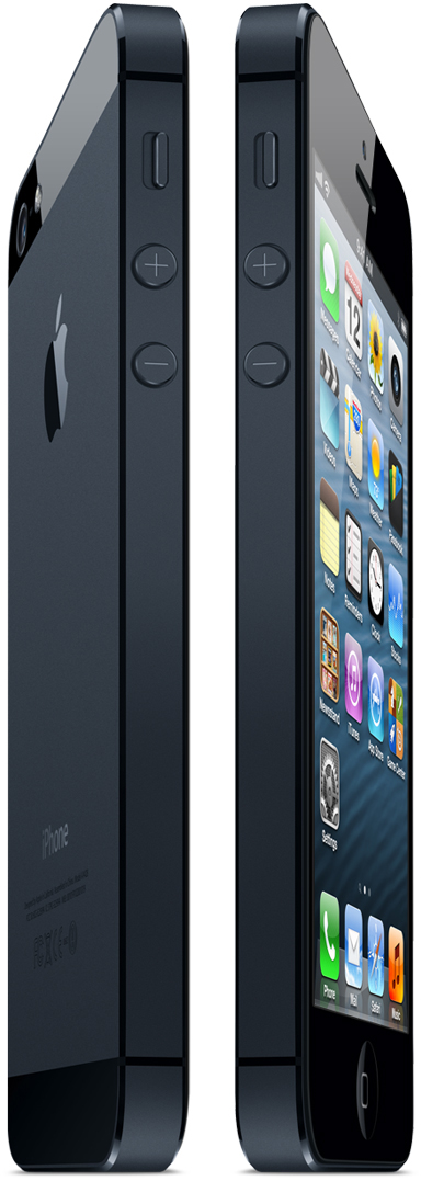
Before that, in 2012, I remember the pre-release comments on the iPhone 5: they questioned the still-square design and, due to rumors and leaks, it was impossible to have an idea of how beautiful the final version would be. And I venture: it was the most beautiful iPhone ever made!
I do not believe that at some point they managed to make an iPhone design as beautiful as the one next to it. From a level of detail, refined and elegant. Each millimeter was taken into account, each alignment. It was the iPhone that, when Phil Schiller introduced it, I really said "Wow!"
Being the flagship, it is natural that it has a visual renewal above the other products: iPhone, iPhone 3G, iPhone 4, iPhone 5, iPhone 5c and iPhone 6: six changes in ten years of history. The best score fired between the product lines. And I hope that, in 2017, we will have a seventh, that everyone will look and, once again, be amazed!
But there is hope: even with a dismal general scenario, it is possible to see in the accessories that Apple is still capable of creating beautiful and unique products. This is proved in the photo below: it may seem silly, but the stands loading and docks are extremely clean and beautiful.
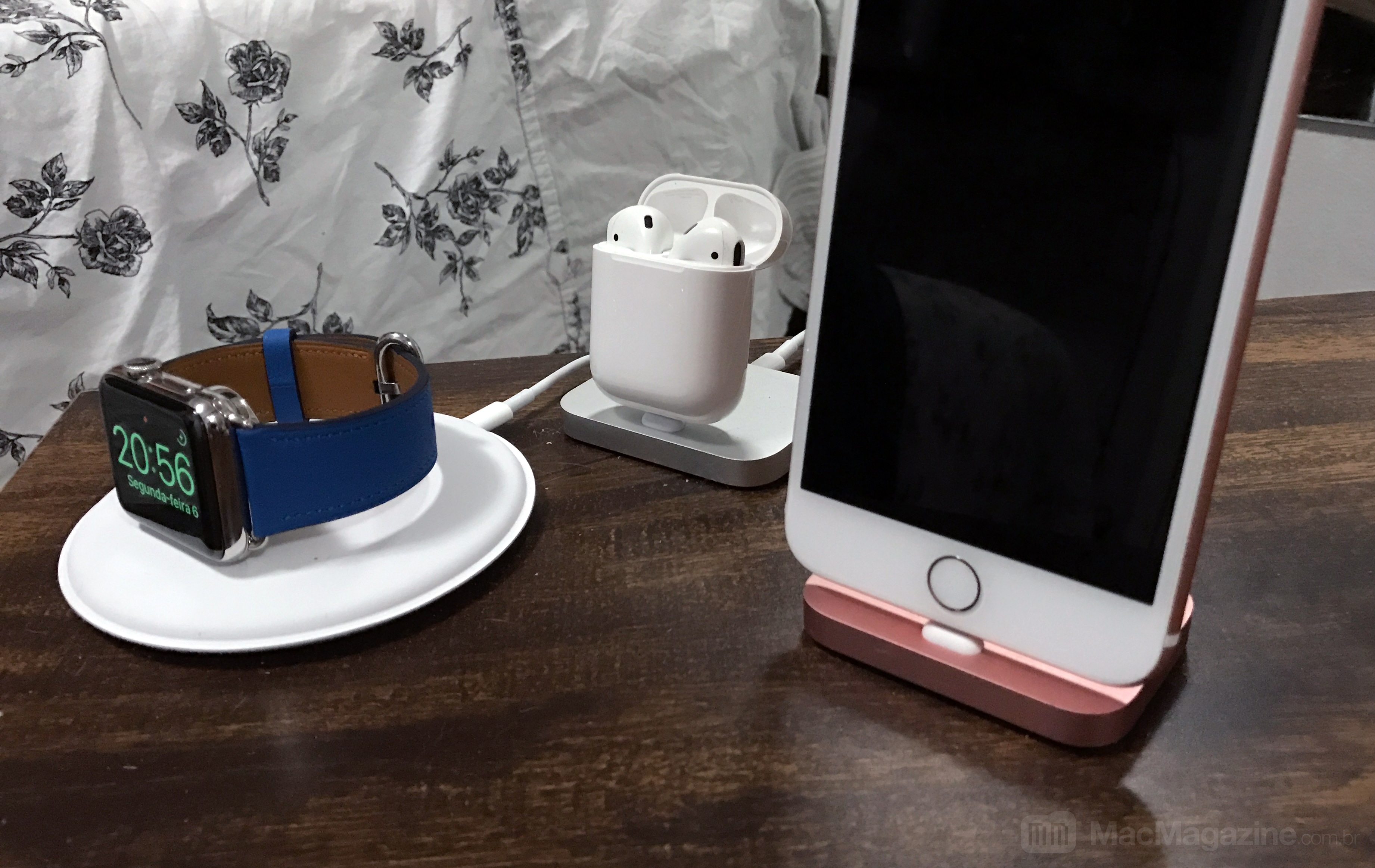
Smooth, uncut and with aluminum matching the device: an accessory that extends the beauty of the device to its base. In the case of the Apple Watch dock, not only is it the perfect place to leave the watch off the wrist, but it also allows use in Headrest mode (Nightstand mode), which turns it into a bedside clock. Simple, but very beautiful.
We also see AirPods: I will not be innocent and talk about how AirPods are indictable, simply because they are not. I am referring to its case, which combines an extremely minimalist design, flat, bright, practicality of charging by inductive contact for the pair of headphones. In addition, the magnetism used to seal both the case and the headphones inside it, reminds us of when magnetism and design are united by Apple, beautiful and practical things are created.
· · ·
All of this makes us reflect and conclude: Apple with Cook has not stopped innovating, but has become a company less susceptible to risks. It is obvious that there is a bright side, that everything they deliver tends to meet expectations; but there is also the downside: what they could deliver, what could be a failure, could also exceed expectations. Anyone who thinks that they stopped in time or lost the ability to innovate is mistaken, but undeniable that they left aside the risks.
Less than 40 days have passed since 2017 and I hope, in the most sincere way, that those waiting for us in front of Apple will make a game-changer for that scenario. May it bring back indito, simplicity and beauty to your new creations. Not with adjustments or adaptations of other lines or products, but to re-create really innovative new products.
