
Tired of the torrent of concepts on iOS 14? So it might be a good idea to take a look at the designer’s latest creation Roland Mészáros: he went a little further and tried to put his vision on paper (or rather, on the screen) for a possible iOS 15.
Mészáros’ concept is centered on minimalism and focuses on home screen of the system: in the designer’s idea, the huge grid of icons would come out and a much more sparse interface would enter, with only the most open applications by the user. At the top, a clock and a small weather forecast icon (okay androidian, if you want my opinion).

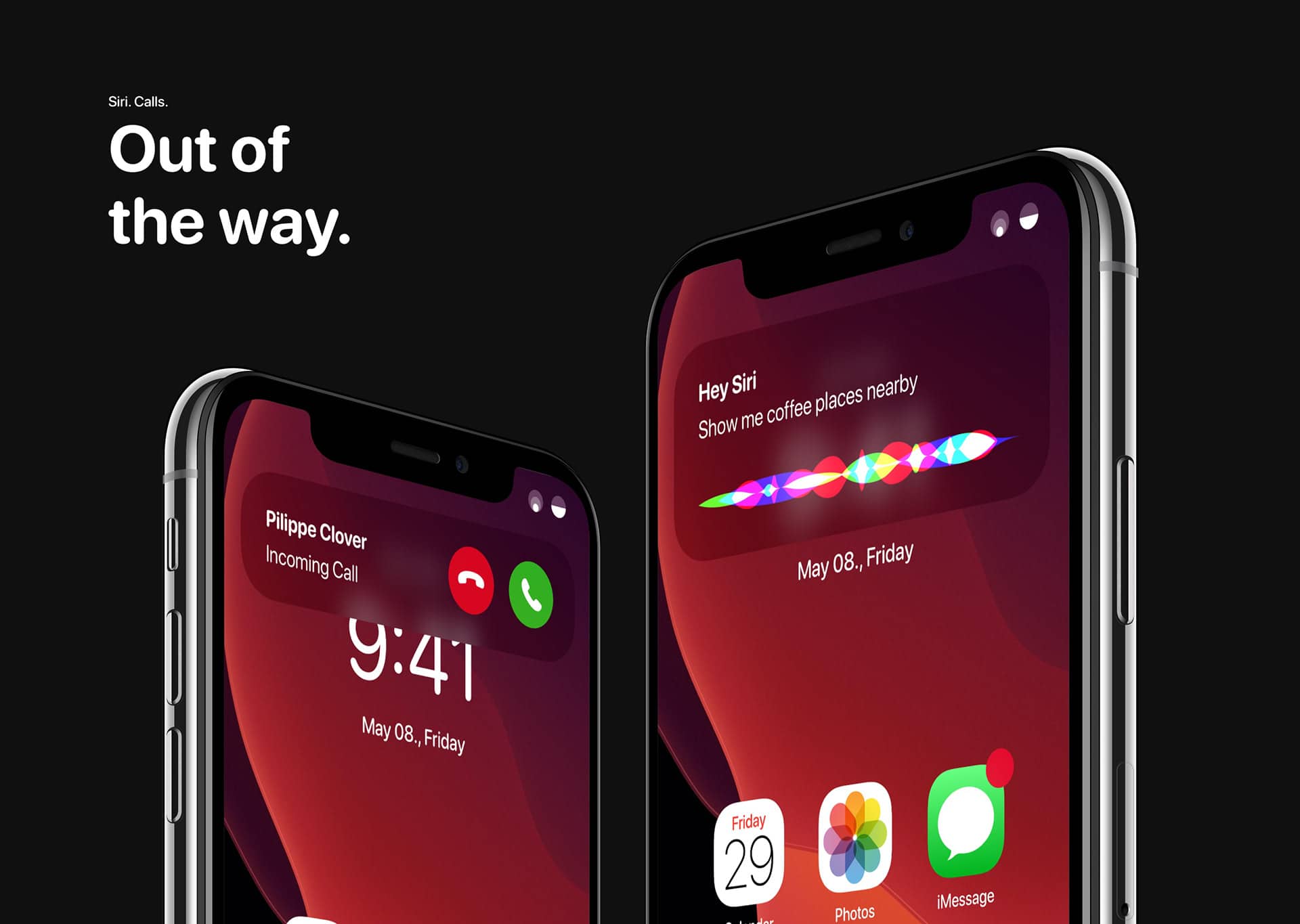
Other elements of the interface also received touch-ups: the Crab would be contained in a small window at the top of the screen, in the same way as the new notification of calls – an old request from users that, if heaven wants, will be answered on iOS 14. Even the icons with the signal and battery levels change in the concept of Mészáros, adopting a circular look.
In general, a very simple concept (like the ideas adopted here), but with a very pleasant look. The question that remains is: does it represent an improvement over what we have today? Leave your opinions below!
via Cult of Mac
